User testing in ux design
Posted on: 25 Mar 2019
Written by: Ngaire Ackerley
 User testing (or usability testing) is all about seeing how easy a design, prototype or piece of functionality is to use on a group of people that represent your users. It can involve observing users as they attempt to complete set tasks or goals. There are a lot of different types of user testing, each have their own suitability for a given situation.
Persona creation and user journey mapping as previously discussed can involve user testing as part of the UX design process. User testing can also be done throughout the wireframe and design stages, prototyping stages and development phases. It helps us understand the users and how they interact with functionality and design.
Often user testing is done based on how much time a project has. Yet, my belief is any good project could at least attempt to do some user testing at each stage. It can be built into the project plan, but really needs everyone on board to believe in the process and consider the findings.
As a project goes live we can continue to test in different ways. It helps us understand if designs and functionality are working well and if the user and company goals are being achieved.
There are lots of different types of user testing, some are more appropriate than others depending on what phase of the project you’re dealing with and what you’re wanting to test for.
It’s important to decide what your goal or aim is out of each user test so that you can keep the questions, answers or options directed towards achieving a purpose.
What are the different types of user testing?
Here’s a basic list of a few main types of user testing. Though I’m sure there are plenty more out there.
Card sorting
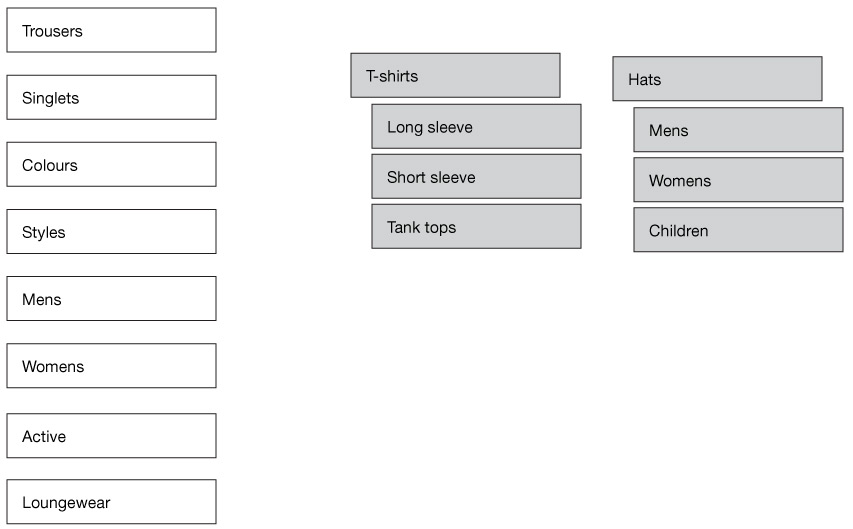
User testing example of card sorting online
Card sorting helps us define navigation and website architecture. It could be a simple online process where users drag and drop items into a navigation-like structure that can be done remotely.
Or, if could be done moderated in-person, with actual cards that each list a navigation item. The users would be given direction and arrange the cards into a hierarchy that makes sense to them.
Useful for: Medium to large websites with lots of navigation. It could be an online store, an intranet or simply a website with a lot of content.
Once you start to understand the types of user testing, like card sorting, you’ll be able to start to think of innovative ways to do the testing to suit your project.
User Surveys
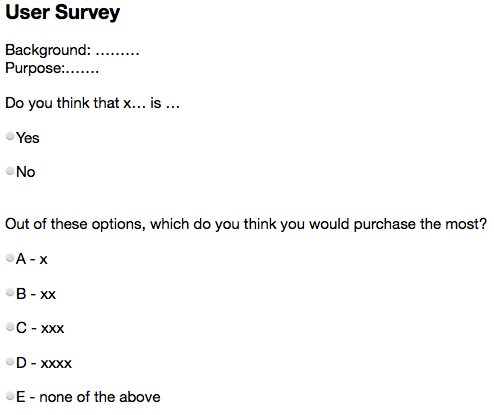
Very basic example of a user survey questionnaire
User surveys can be useful throughout a project and done in a variety of ways.
Remotely, you could set up an online survey with questions and options for your users. These often have multi-choice or yes/no options so that you can get definitive answers. If you have any open ended questions, try to be detailed enough and concise so that the answer doesn’t go off topic. Remember, you’re not face-to-face with the user, so you don’t have the luxury of re-directing them towards the purpose of the question or giving them more explanation if needed.
For in-person user surveys, much like a user interview, you’ll want to prepare questions and explanation in advance. Remember you’re using up someone elses precious time, make it count.
Useful for: Discovering user personas, investigating a project idea, finding out user preferences
User interviews
User interviews can be done for many reasons. It could be that you want to gage someone’s reactions and be able to expand on questions. They can be more detailed than user surveys, but in much the same way, they need to be directive. Even more-so, than a survey, you’ll probably take up more of the users time and time is money!
Useful for: Discovering user personas, investigating a project idea, testing wireframes make sense, validating designs and prototypes
Testing user flows and achievability
You may find that you’ve done all the user journey mapping you can based on analytics and talking to people involved in the project. You may have done card sorting and now want to see if the user flows you’ve created will actually work. Can your users actually achieve their goals (and hopefully your company goals) easily?
You may do simple sketches or create online prototypes to run through with people. Again, you could think about whether remote or in-person will be best for this test based on your project and level of complexity involved.
Design tests
Design tests can be as basic as finding out what icon a user thinks means ‘Account Details’
Design tests could be done in-person or remotely in some cases. They can be done early on with simple sketches or wireframe designs. As you get deeper into the project and design you may want to validate the design further, whether its page layouts or elements. It could be working out colours, wording and icons.
You may want to create an online remote preference test. Does a user prefer design A or design B and why?
Depending on the level of test will help you decide how to do the design test.
If you’re testing whether a user will click on one icon vs another icon, you may be able to do a simple remote preference test online.
However, if you’re testing a flow or function in a prototype you may need to do an in-person test where you give them a bit of background and direction and watch them complete a process. You may be able to interview them on aspects of why they did certain things. In such tests, its often good to have the test being filmed, ideally by the computer or app itself so that you’re not putting the user off by a big camera in the room. Videoing the test allows us to see the users reactions and where they are clicking. It allows us to see if they are having any struggles or if they say one thing and do another. Make sure you have written permission before filming any users though!
Having a note taker can also help the process so that the person conducting the test can be watching the user and answering questions without missing anything.
Useful for: Validating wireframes, designs, interactions and functionality
A/B testing
A/B testing involves testing different variations of a design or function to decide which one works the most effectively. This is often done once a project is live or in its beta phase. Often websites can figure out the best solution through analytics based on where a user clicks.
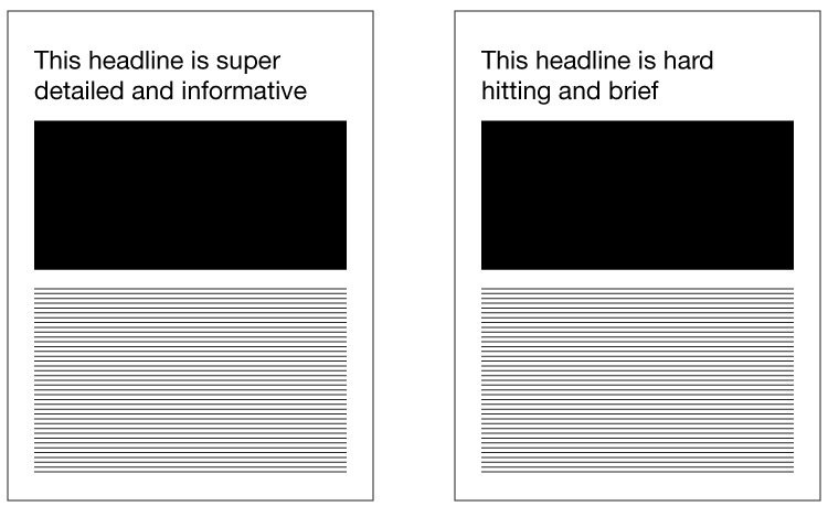
Example of testing a headline change some users will see the left one and some will see the right one
A/B testing often involves just two options, but sometimes could be more. It’s very important to be extremely directive in the two options, ideally changing just one element to understand that is the users preference. If you’re changing multiple elements on a page if becomes more difficult to identify why a user preferred one choice over the other.
Useful for: Headlines, marketing visuals, function and design updates, solving pain points, reducing bounce rates
Online user testing tools
There are LOADS of online user testing tools. Each have their own benefits and costs, some will provide users and some are simply there for you to use with your own users. Often design and prototyping programs will also have their own testing systems or ones they connect to best. So it is worth considering what programs/tools you’re currently using and what ones will help you achieve your user tests the best way that works for you. I won’t go into all the online testing tools, but here are a few to get you started:
https://usabilityhub.com
https://www.optimalworkshop.com
https://lookback.io/
https://www.surveymonkey.com/
https://www.hotjar.com/
https://www.usertesting.com/
https://www.invisionapp.com/
https://marvelapp.com/user-testing/

