User journey mapping
Posted on: 18 Mar 2019
Written by: Ngaire Ackerley
User journey mapping shows a users’ process as they complete a task or goal.
It shows how they navigate through interactions and functionality, what their emotions are and any obstacles they face.
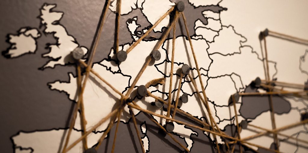 When I used to think of a journey map, I’d think of a travel map — where a plane travels from country to country.
Whereas, a user journey map in the context of user experience design, is more of a detailed diagram and/or description of each point of a website (or application) a user visits and what is happening at that moment.
What does a user journey map involve?
It has a series of steps that a user might take, their interactions with a website or app to reach a certain point or goal. In other words, it is how they navigate through a product to try to achieve something.
How do user journeys help UX?
Identifying user journeys is a key aspect in user experience design and user research. It helps us understand a users behaviour, identify key functionality and can help define navigation and interface requirements.
We need to identify user journeys so that we know what pages to design. It can involve finding out what high-level functionality needs to be on a page. It could be as simple as key buttons or links so the user can get from to get from A to B. It can start to help a designer understand pieces that need to go into an early wireframe design as they build up the layers to a web/app page.
How do I create a user journey?
In a project you may have a lot of ‘happy’ and ‘unhappy’ user journey paths that a user may take which can become part of your internal testing as a project progresses. A ‘happy’ path is when the user reaches their goal. Whereas, an ‘unhappy’ path is when something gets in their way or they don’t complete their goal.
In the early stages of a project I like to identify the ‘main’ user journeys that a user takes to achieve the main tasks of a website or app based on the user personas.
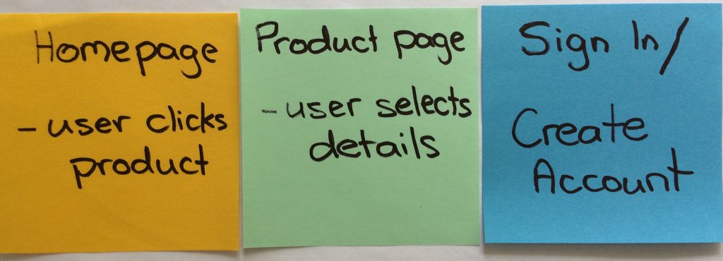
Super basic example to reach a sign in or create account page
In the early stages of a project user journeys can often be identified with website analytics, heat maps and discussions. You could even do user interviews or surveys based on sketches, wireframes or existing designs. As you progress you’ll want to flesh these paths out and may want to confirm that users actually do what you think they do. Or, you may want to suggest a new path they could take and test that with a user to see if it is realistic.
What does a user journey look like?
With each main user journey it is often good to provide context.
- What is the users environment?
- What device/browser are they using?
- Are their any distractions around them?
From there it’s a process of how they navigate through the website or application. What are their key steps? Then it is important to think about pain points.
- What are their emotions at each step?
- Are they potentially getting frustrated with how long it is taking?
- Are they having difficulty finding something?
- Do they achieve their goal?
Simply mapping these aspects out can help us identify what we need to consider or change in our design or functionality. It is good to flesh these out into happy and unhappy paths — where a user achieves and doesn’t achieve their goal.
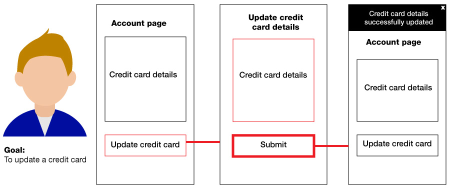
Basic example of a user journey to update a credit card
For instance, a user might successfully update their credit card details on your website and see a message confirming their details are updated. In another user journey, they may find their credit card is invalid and need to change their details based on an error message they see. Each user journey can inform different aspects that a designer needs to consider including as they build up the design.
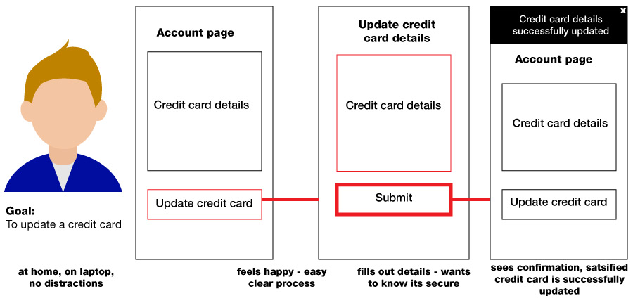
Notes about emotions at each interaction
Mapping out these user journeys can also show us what our designs are missing. It could be simple error message details, a close or back button for instance.
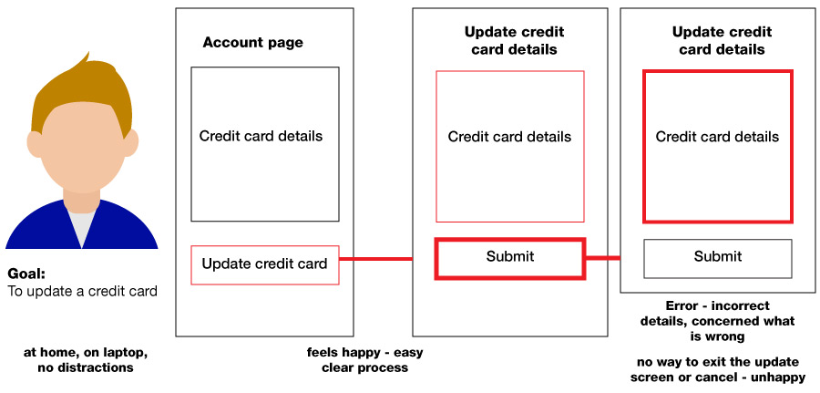
Example of a basic unhappy path where user is unsuccessful
An in-depth project can have a lot of user journeys. You may not create notes about the users for every user journey based on a persona. They may become an array of post-it notes on a wall or a vast sketch on a whiteboard. However, in the early stages of a project its worth having a few detailed ones to visualise to give context to a design project.
I’ve found user journey mapping to be vital to the projects I work on. My rough sketches and diagrams have often ended up plastered around a project room and being referred to by testers, developers and other key people in a project.
User journeys can shift and evolve through a project as designs and functions get fleshed out. They are often reference points throughout a project and key reminders to lots of people, not just the user experience (UX) designers.
« Back to Blog
