Re-design process of designack.com (Part 1 of 2)
Posted on: 4 Aug 2014
Written by: Ngaire Ackerley

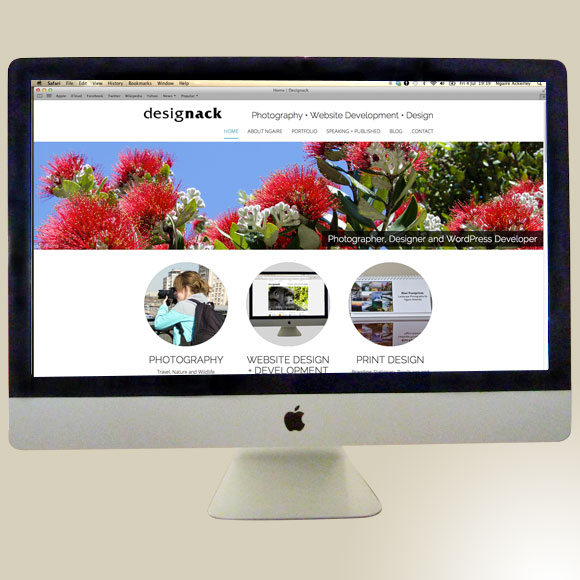
A few months ago I decided it was time for a refresh on designack.com. The previous site was not responsive, the galleries often had hiccups and I felt it didn’t display my skills of photography and web development enough. It was a few months out from WordCamp Bournemouth, where I was giving a presentation to a UK-wide audience of WordPress designers, developers and users. It was not going to be a good look to present without my own website being responsive and up-to-date.
So this meant I had a deadline. Having a deadline is something that I found vital when you’re doing your own personal projects. I told myself development needed to be complete at least two weeks before my presentation to allow me time to load up content and go live.
I decided to take this project seriously like I would a client project so that I could produce a site that I’d be happy with for the next few years hopefully. This meant following this process:
- Decide a timeline
- Decide what my goals are for the new site
- Decide what I like and don’t like in the current site
- Decide what new content I want to add and/or amend
- Research other sites for inspiration
- Sitemap
- Wireframe
- Design
- Develop
- Responsive
- Test cross browser/device
- Prepare/add content
- 301 redirects/Go live
Unfortunately due to time I had to leave out user testing and feedback of this site. However, I’m sure tweaks will come in the future when I have time.
Timeline
I set out a timeline from end to start. So when the site would go live, to working back to the start:
- Go live
- Adding content (2 weeks)
- Testing (1 week)
- Developing (2-3 weeks)
- Wireframe/designing (2 weeks)
- Goals/brainstorming (1 week)
This was always going to be a tight deadline since I had a lot of content to convert over and work a day job as well as having a number of side projects.
Goals
I like to keep my goals wide open to begin with, knowing that not everything will be achieved at this point. Aspects such as selling photography requires more thought as to whether it is appropriate and which route to go down for that. I wanted to make the site easier to update, have cleaner navigation and portfolio sections. The galleries also needed work to be more user friendly and have cleaner code.
This was my rough brainstorm of a few other goals:
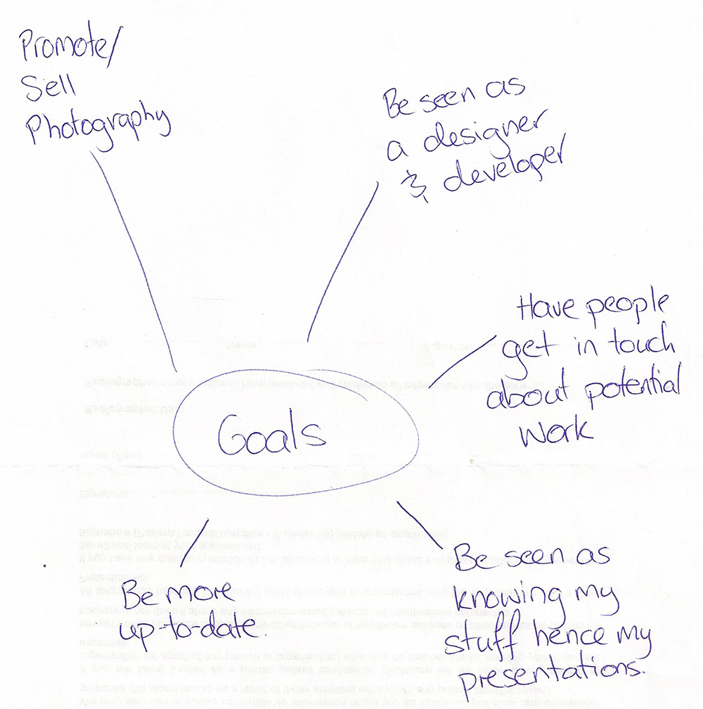
Goals of the new designack.com website
Brainstorming likes, dislikes, new content and amends from past site
This is just a few of the thoughts I came up with initially:
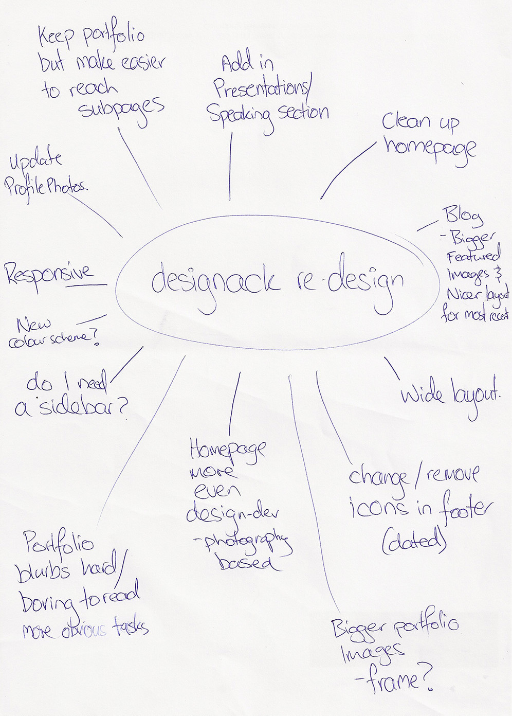
Brainstorm of ideas and improvements on designack.com
Research other sites for inspiration
This included portfolio sites, photography sites, agency sites and WordPress specialist sites. I focused on specifics like galleries, homepages and portfolio pages. I also looked into a range of responsive sites for further ideas of how to transform the site where appropriate.
Sitemap
I wanted to simplify the navigation to make it easier to access portfolio sections directly, this would mean changing url structures so I would need to consider 301 redirects when I go live with the new site. I also had new sections I wanted to add in so people could see my presentations and where my writing and photography have been published also.
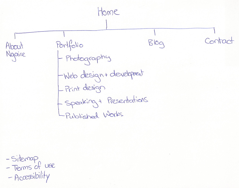
Sitemap of the new designack.com website
Next week I will continue to explain more about my process, focusing on the design and development that followed on from the initial ideas and brainstorming.
« Back to Blog
