New Zealand Herald Registration flow
What I was responsible for in this project:
- UX/UI research
- User flows
- User testing
- Sole digital responsive designer of UX/UI
- Co-developed the front end in SASS/HTML/React
- Cross browser/device testing
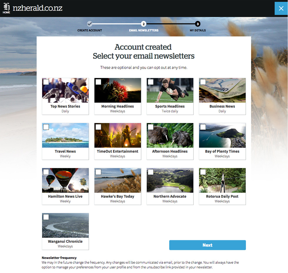
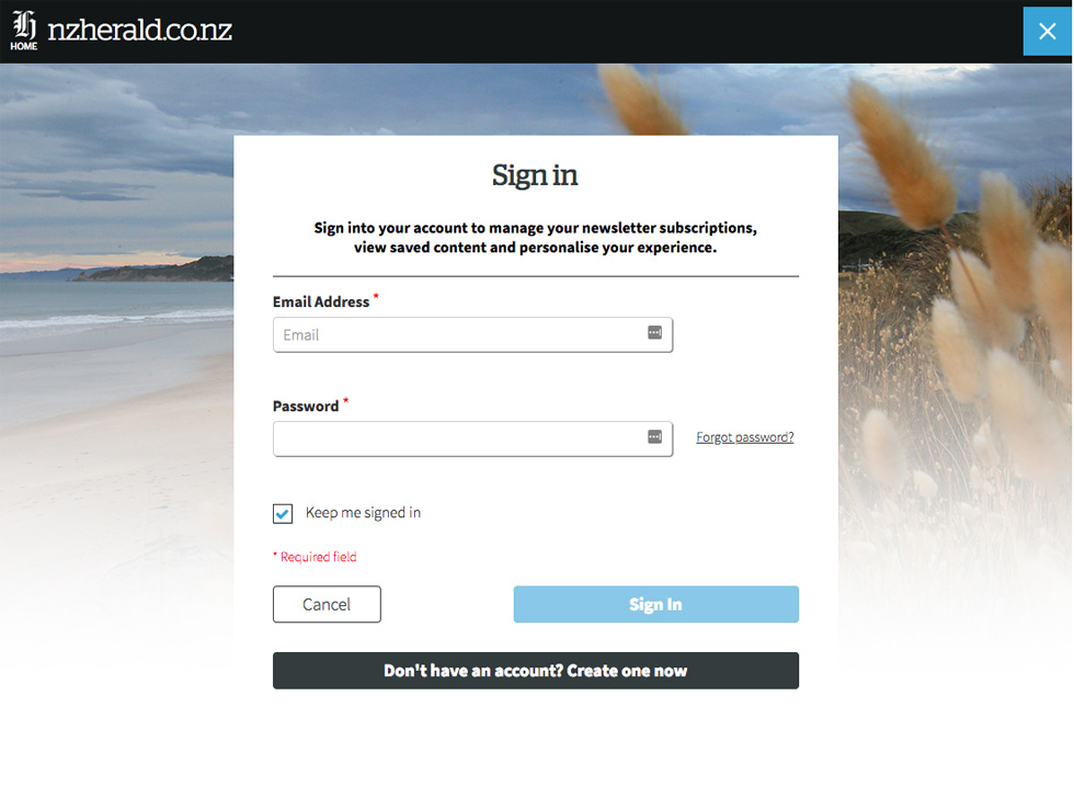
The digital redesign of the New Zealand Herald’s registration flow needed to be easy to use and encourage email newsletter signups. The design style I used was photographic to be cohesive with the rest of the website design style and catch the users eye. User progress tracking and functions were also considered.
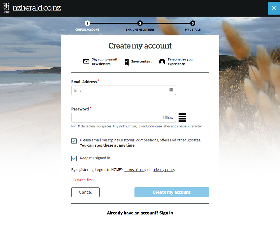
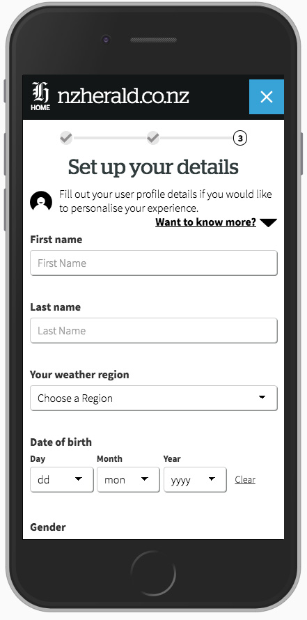
The UI/UX digital design is responsive with strong mobile, tablet and desktop size considerations. It’s important that this process was very easy to use on any device and encouraging to the user. The design of the input fields, links and buttons were all designed with finger size in mind.
User personas, user flows and user testing were all part of the process with this project. This was a big change from the exisiting design so it was important that users were encouraged and not put off by the process. It heavily informed the design and the discussions around the project.
The new flow was designed into 3 simple steps, allowing the user to create an account on the first screen and add value to their account as they progress.
Email newsletters was changed from a simple text list to have images to convey more about the content of the newsletters, frequency was also added to be transparent and show how often people would receive their newsletters.
